Tattoo-inspired geometry shapes Minnesota Lynx Pride Night shirt
Sarah Biloon turned the Lynx secondary logo into a Pride Night shirt built like a tattoo flash piece, with a centered anchor and tight geometric framing.
.jpg&w=1920&q=75)
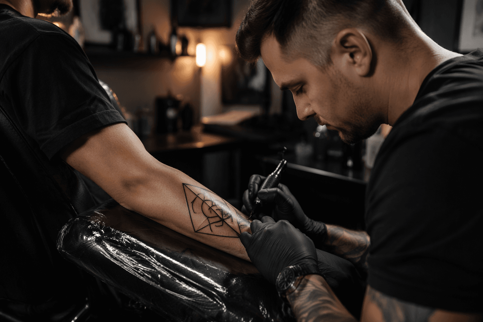
Sarah Biloon built the Minnesota Lynx Artist Series Pride Night shirt the way a strong geometric tattoo gets built: one clear focal point, clean surrounding structure, and line decisions that keep the whole piece readable. The Minneapolis artist behind BlackEnd Tattoo Atelier centered the Lynx secondary logo and wrapped it in Pride colors for Sunday, June 21, 2026, giving the shirt the feel of a composed body piece instead of a loose souvenir graphic.
Biloon said the logo had to sit front and center because she likes front-facing subjects and builds everything else around one anchor. That choice is familiar to anyone who has sat through a tattoo consult and watched a design get pulled apart for balance, placement, and flow. If the main element drifts even slightly, the whole composition starts to feel off. Here, the logo stays locked in place while the surrounding geometry does the supporting work.

What makes the shirt especially relevant to geometric tattoo readers is the way Biloon treats structure as the main event. She traced the surrounding shapes to the strong lines and geometric forms she absorbed in the 1980s, and that shows in the finished layout. The framing is assertive, but it never smothers the center. The lines create order around the logo instead of fighting it, which is the same pressure test tattoo artists face when they build symmetry around a medallion, crest, or ornamental core.
Biloon also described linework as a way to turn something chaotic into something calm. That idea lands directly in geometric tattooing, where spacing, symmetry, and line placement decide whether a design reads crisp or noisy. The Pride colors add more than decoration, too. Biloon framed them with a kind of war-paint energy, which gives the shirt a sharper edge and keeps the palette from feeling soft or purely celebratory.
The bigger takeaway is that this was never just team merch with a rainbow treatment. It was a public-facing design that carried a tattoo artist’s visual language into sports apparel without losing discipline. For geometric tattoo fans, the lesson is plain: when the anchor is strong and the framing is deliberate, color can move hard and still stay under control.
This article was produced by Prism’s automated news system from verified source data, official records, and press releases, then run through automated quality and moderation checks before publishing. The system is built and supervised by the people who set the standards it runs under. Read our full AI policy.
Did this article answer your question?