Think Tank Tattoo explains how spider-web tattoos change with geometry
Spider-web tattoos shift hard when geometry, placement, and line weight change, and Think Tank’s guide shows which versions age best.
Why the motif reads differently every time
A spider-web tattoo is not just a spider-web tattoo once geometry gets involved. Think Tank Tattoo’s guide treats the motif as a design system, not a fixed image, and that is the useful shift for anyone planning a piece in 2026. The same web can read as traditional, graphic, personal, or transformative depending on how dense it is, where it sits, and what sits around it.
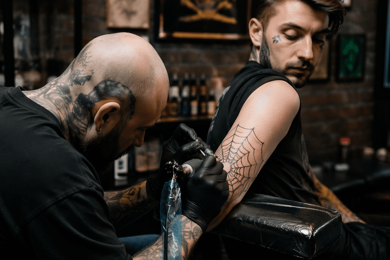
That flexibility matters because the design carries a complicated history. The guide notes its ties to U.S. prison culture in the mid-to-late 20th century, but it also shows how the motif now lives widely in mainstream tattooing and alternative communities as a sign of resilience, individuality, and nonconformity. In other words, the web still carries weight, but the meaning is no longer locked to one context.
Placement, scale, and the problem of clarity
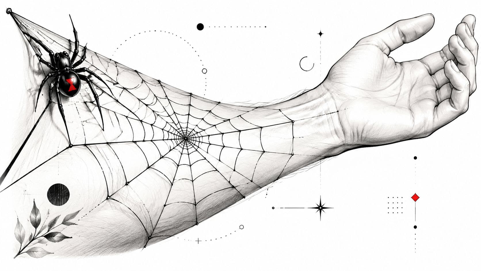
Where the web lands on the body changes the read immediately. A spider web on a forearm does different work than one across a joint, and the guide is clear that the body placement has to support the structure of the drawing rather than fight it. That is especially important for readers thinking in geometric terms, because a web that is too compressed can lose the clean tension that makes the motif feel intentional.
On the arm, the safest move is usually to keep the web broad and readable so the spider can carry the detail. Once the web becomes too dense, or the spider sits too far away from the strands, the composition starts to blur and the whole thing loses clarity. That is the kind of practical design call that separates a strong web from one that feels crowded before it has even healed.
Joint placement pushes the idea in a different direction. An elbow or knee placement turns the web into something that interacts with motion, which can make the pattern feel more structural and less decorative. It also makes the placement part of the meaning: the tattoo does not just sit on the body, it follows the body’s geometry.
Eight directions the guide opens up
Think Tank Tattoo breaks the idea into eight distinct directions, and each one changes the balance between symbolism and structure.
Classic black widow web
The classic black widow web keeps the motif rooted in its most recognizable form. It works when you want the web to feel direct and historically loaded, with the spider acting as the sharp visual anchor.
Geometric minimalist web
The geometric minimalist version strips the design back to its essentials. This is the lane that speaks most directly to geometric tattoo readers, because the web becomes a study in spacing, symmetry, and line discipline rather than in heavy texture.
3D realistic illusion
The 3D realistic illusion shifts the web from flat structure into visual trickery. It makes the motif feel more dimensional, which can be powerful when the goal is to transform a familiar symbol without abandoning it.
Watercolor version
The watercolor take pushes the design away from strict black-line read and toward movement and softness. It is the least rigid of the group, but it still relies on the web’s underlying structure to keep the composition from dissolving into pure color.
Mandala spider-web fusion
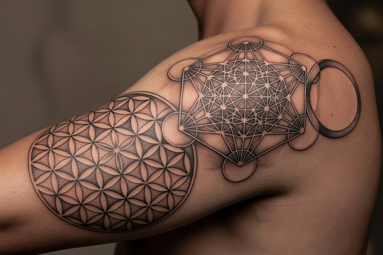
The mandala fusion is where geometry becomes the point instead of the backdrop. Here the web can echo radial symmetry and patterned repetition, giving the motif a more meditative and ornamental feel while keeping its spider-web identity intact.
Insects and nature elements
Adding insects and nature elements expands the story around the web. This version works best when the surrounding details support the web instead of overpowering it, because the core motif still needs room to breathe.
Elbow or knee placement
The elbow-or-knee option uses the joint itself as part of the design logic. That placement can make the web feel built into the body’s architecture, which is exactly where a geometric approach can add impact without forcing extra ornament into the piece.
Dotwork or stippled web
The dotwork or stippled version is one of the most practical options in the guide because it can beat linework in some cases. That matters when you want a softer visual finish or a more granular texture, especially if crisp lines would make the design feel too hard or too literal.
How to choose a version that still makes sense later
The guide keeps coming back to one simple decision tree: meaning, visibility, and aging. If you want the tattoo to read as graphic, the structure needs to stay clean and legible. If you want it to feel more personal or transformative, the supporting elements and the geometry around them need to carry that shift without burying the web itself.
That is why line strategy matters as much as motif choice. A minimalist web can age cleanly if the spacing is honest and the shape has room to breathe. A denser web may look more dramatic at first, but if it fights the spider, crowds the joint, or folds too many ideas into one small area, the design loses the very clarity that makes geometric work hold up.
The strongest takeaway from the guide is that spider-web tattoos live or die on structure. Once you decide whether the piece should feel traditional, geometric, symbolic, or experimental, the placement and line choices fall into place fast. That is the real split Think Tank’s guide makes clear: the web only works when the geometry lets it stay a web.
Know something we missed? Have a correction or additional information?
Submit a Tip