Why bold blackwork tattoos age better on textured skin
Bold black geometry holds its shape longer on textured skin, while fine linework can blur into visual mush. The trick is choosing the right fills, gaps, and placement before the ink ever settles.

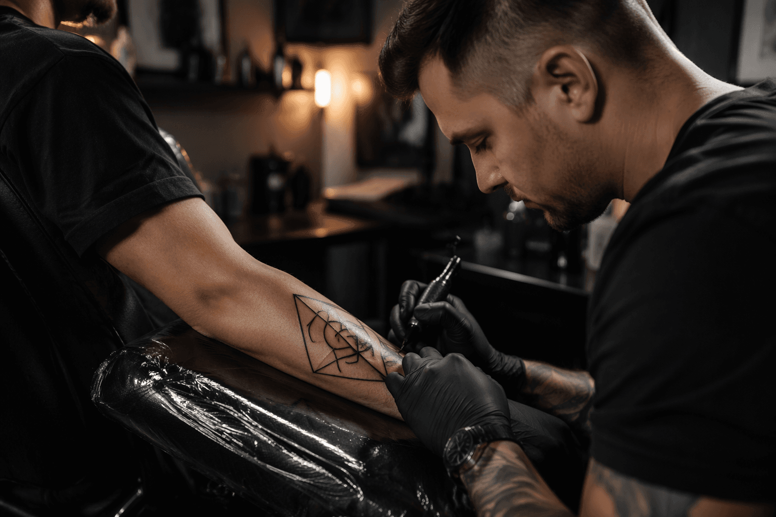
Bold blackwork survives because it gives the skin room to age without losing the drawing. On textured forearms and chests, where movement, friction, and sun exposure keep working on the ink, heavy silhouettes and solid fills tend to read cleaner over time than delicate single-needle geometry. That is the real argument here: not that blackwork is louder on day one, but that it still looks intentional at year five.
Blackwork is a structural choice, not just a style choice
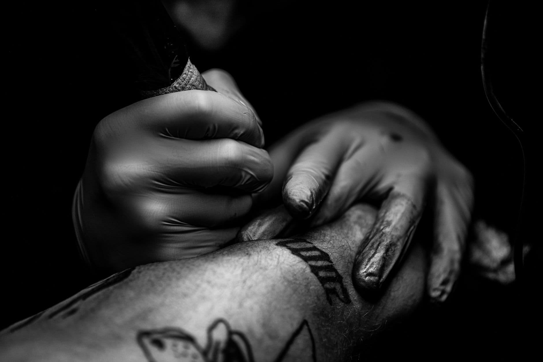
Geometric tattoos fail when they lean too hard on thin lines to do all the work. Fine linework can look elegant fresh out of the chair, but the more a design depends on tiny spacing, hairline corners, and fragile micro-detail, the easier it is for healing and aging to soften the whole piece into visual static. Saturated black, by contrast, gives the design a stronger spine. It keeps the silhouette legible even after the skin settles, stretches, and gets hit by daily wear.
That is why bold black silhouettes and disciplined fills matter so much. Thick bands, dark anchors, and clearly defined negative space help the eye separate one shape from the next. If the composition starts with enough contrast, it has a better chance of still looking deliberate when the crispness of the original stencil is gone.
The parts that age best are the parts with room to breathe
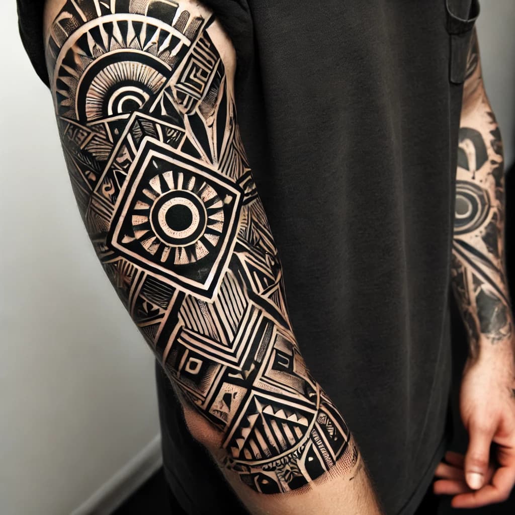
The strongest geometric blackwork is built around simple, readable shapes: large triangles, stacked arcs, concentric frames, and panels with a clear hierarchy of black and open skin. These forms hold up because they do not rely on tiny details to explain themselves. Once the skin heals, the design can still “read” from across the room.
The pieces most likely to turn heavy are the ones that cram too much into too little space. Tight line grids, overly delicate mandalas, and skinny ornamental lanes can collapse as the ink settles, especially if the gaps between elements were already narrow. The fix is not to remove detail completely. It is to control it, leaving open lanes wide enough that the tattoo can age without the black masses merging into one dark block.
Placement can make or break the result
This is where the conversation stops being about taste and starts becoming practical. A geometric calf panel makes sense for a reason: the calf handles saturation well, gives the artist a broad surface to work with, and carries less blowout risk than more punishing zones. That matters because geometric work depends on clean edges and stable spacing.
Curved and bony areas are the trouble spots. Wrists, feet, and collarbones are notorious for blowout risk, especially when the needle angle is wrong or the skin is harder to work cleanly. The issue is not just pain or discomfort. It is that these areas make it easier for lines to wander and for saturated sections to distort as the tattoo settles. On those zones, a delicate geometric design can lose its edge fast.
Forearms and chests sit in a more complicated middle ground. They can take strong blackwork beautifully, but they also face more movement and more day-to-day exposure. That is why thicker anchors and simpler geometry often outperform fragile ornamental detail there. The body is not a flat page, and the tattoo has to be designed like it knows that.
Sun, healing, and the long game
A tattoo is not finished when the redness fades. The American Academy of Dermatology notes that tattoos can fade from UV exposure and recommends sunscreen, while also warning against tanning beds and sunlamps. That advice hits geometric work especially hard, because the whole language of the style depends on contrast. If the black softens and the lighter areas darken around it, the composition loses the tension that made it work in the first place.
Healing also takes longer than people want to admit. Cleveland Clinic says larger tattoos can take a few months to fully heal, and redness and swelling can linger longer than expected. That is another reason bold blackwork needs to be planned with patience. What looks dense on day one may settle much cleaner than a dainty design that appears “light” at first and then fades into weakness.
The Food and Drug Administration also treats tattoos as permanent and advises reporting adverse events related to tattoo inks. That permanence is exactly why geometric blackwork deserves more planning than impulse. If the tattoo is going to live on the body, the layout has to survive the body.
Ötzi already knew the logic
There is nothing new about using dark, body-based marks to create structure. Ötzi the Iceman, found in the Alps and identified with 61 tattoos, had lines and crosses rather than decorative miniature scenes. The South Tyrol Museum of Archaeology says those marks were made with fine incisions filled with pulverised charcoal, which gives today’s blackwork conversation a much older ancestor than most people expect.
A 2024 study revisited Ötzi’s tattooing technique using comparisons with modern methods, and the parallel is useful. The marks were not about delicate ornament for its own sake. They were about direct, readable body marking that stayed clear on skin. That is the same design logic behind the best modern geometric blackwork: make the shape strong enough that the body can carry it without it falling apart.
How to choose the smarter geometric option
- use bold silhouettes where you want long-term readability
- keep open space wide enough that the composition can breathe
- save fine linework for accents, not the entire framework
- choose flatter, more forgiving placements when possible
- avoid stacking too much detail into curved or bony spots
If the goal is a high-contrast tattoo that still reads clearly after healing, saturated black is usually the smarter geometric choice when the design needs to anchor the body. The winning formula is simple:
The best geometric blackwork does not try to fight skin texture. It uses it. It lets the black do the structural work, lets the negative space keep the piece from collapsing, and chooses placement like the body is part of the design system, not an afterthought. That is why the strongest black geometry does not just look cleaner on day one. It holds its shape when the skin has done its part, too.
This article was produced by Prism’s automated news system from verified source data, official records, and press releases, then run through automated quality and moderation checks before publishing. The system is built and supervised by the people who set the standards it runs under. Read our full AI policy.
Did this article answer your question?