Why Linework Defines Geometric Tattoos and Lasts for Years
Clean linework is the difference between a geometric tattoo that ages into structure and one that blurs fast, especially when spacing, symmetry, and skin placement are right.
Linework is the backbone of geometric tattooing
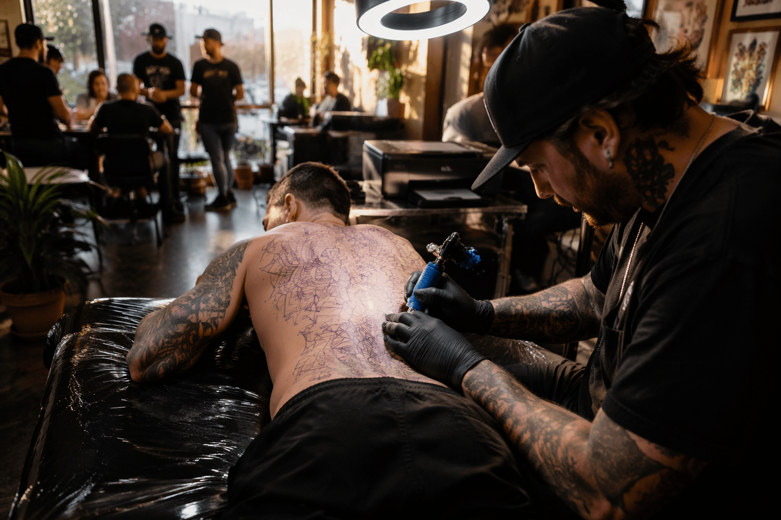
Geometric tattoos live or die on the line. Unlike heavily shaded blackwork or color pieces that can hide uneven execution inside texture, geometric linework leaves everything exposed: the stroke, the angle, the spacing, and the symmetry. That is why the style rewards restraint. When the artist commits to line alone, every decision becomes visible, and that clarity is exactly what gives geometric work its power.
The best geometric pieces do not just look crisp on day one. They are built so the structure still reads years later, even as skin shifts and the lines soften slightly with age. Solid black lines, deliberate negative space, and controlled edges give the design a durable framework. If the linework is weak, the whole tattoo starts to look busy instead of intentional.
What separates clean geometry from a minimalist tattoo
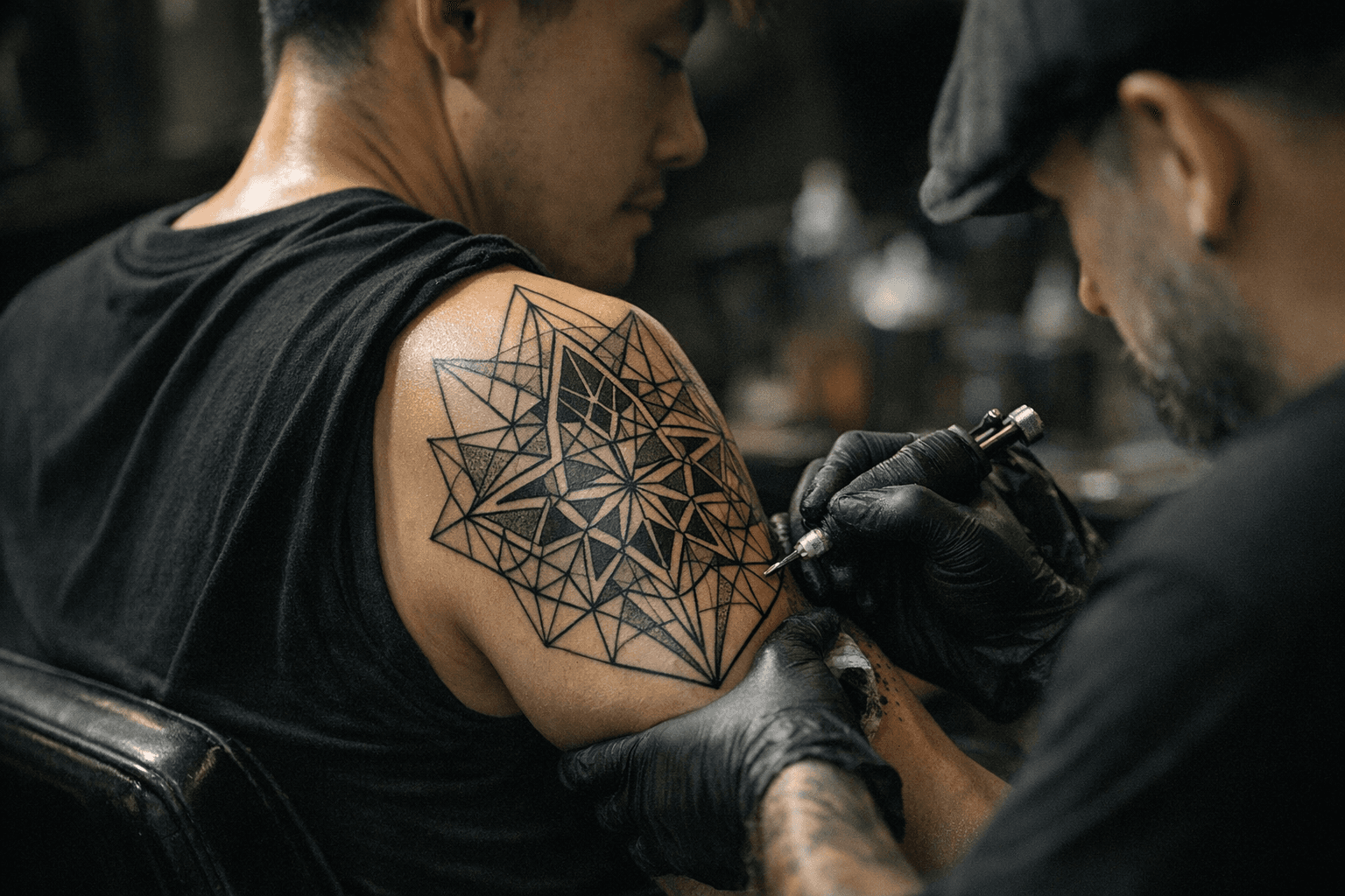
A minimalist tattoo can be tiny and simple without demanding much from the artist beyond neat placement. Geometric linework is less forgiving. It depends on repeated precision, because the design often uses mirrored shapes, equal spacing, and hard angles that reveal even small inconsistencies. A slightly crooked line in a minimalist symbol may pass unnoticed; in a geometric mandala, it can throw off the whole composition.
Look closely at three things: line weight, spacing, and symmetry. Line weight should feel consistent unless the design intentionally varies it for hierarchy. Spacing should be even enough that shapes breathe, but not so open that the tattoo loses structure. Symmetry has to hold up across the whole body, not just within a single motif, because a pattern that drifts with the curve of a shoulder or forearm can break the illusion of precision.
Why geometry ages differently
Longevity is one of the biggest reasons linework matters so much in geometric tattoos. Shading can fade into patchiness, and color can wash out unevenly, but a strong black outline tends to preserve the design’s read for much longer. Even when lines thicken a little over time, a well-built geometric tattoo should still look like linework decades later.
The American Academy of Dermatology notes that ultraviolet light can fade tattoo ink, and it also warns that petroleum-based products such as petroleum jelly can contribute to fading during aftercare. That makes daily care part of the tattoo’s final look, not an afterthought. A geometric piece that is carefully lined but repeatedly overexposed to sun or treated with the wrong ointment can lose the crispness that made it work in the first place.
Placement changes everything
Body placement is not just about aesthetics in geometric work. It determines whether the design can hold its shape as the skin moves, flexes, and ages. Areas with flatter, steadier surfaces often make it easier for straight lines and mirrored forms to stay clean. More mobile or thinner areas can distort the visual geometry, especially when the tattoo depends on exact alignment.
That matters because tattoo biology is not static. A 2023 study indexed in PubMed examined pigment in fresh and older human tattoos and found pigment localized down to the reticular dermis, which helps explain why tattoo ink remains embedded rather than sitting only at the surface. At the same time, medical literature describes tattoo blowout as pigment moving beyond the intended borders, a risk that is especially noted in thinner skin areas. In geometric tattooing, where border control is everything, that risk can turn a sharp design hazy.
Why black ink and negative space do so much of the work
Geometric tattoos usually rely on black ink for a reason: black creates the strongest contrast, and contrast is what keeps a pattern legible as skin changes over time. Grey wash can soften the look, but it also introduces more room for fading and blur. For a design built on exact shapes, clean black linework often outlasts decorative effects that depend on tonal subtlety.
Negative space matters just as much. The empty skin around a line is part of the design, not wasted space. When the spacing is deliberate, the tattoo reads as architecture instead of clutter. That is the difference between a piece that feels organized and one that starts to collapse visually as soon as the linework loses a little sharpness.
The public appetite for tattoos is bigger than the style itself
Geometric tattooing sits inside a much broader tattoo culture that keeps expanding. Pew Research Center found that 32% of U.S. adults said they have at least one tattoo, and 22% said they have more than one, based on a survey of 8,480 adults fielded from July 10 to July 16, 2023. The same dataset found that 69% of adults with tattoos said they got any tattoo to honor or remember someone or something, and 47% said they got one to make a statement about what they believe.
Those numbers help explain why linework-heavy geometric tattoos resonate so strongly. They are often chosen for meaning, discipline, and permanence. When someone picks a design meant to represent memory, identity, or belief, the durability of the line becomes part of the message.
The style has deep roots, not just modern appeal
Geometric tattooing may feel current, but it sits on top of a long visual history. Smithsonian Magazine notes that Polynesian tattoo traditions developed over millennia and feature highly elaborate geometric designs. That legacy matters because it shows geometry is not a trend built only for contemporary tattoo shops. It is a language that has carried meaning through generations, often through repetition, symmetry, and pattern.
The same historical weight shows up in older tattoo discoveries. Smithsonian Magazine reports that Ötzi the Iceman’s tattoos are about 5,200 years old and include 61 markings, found on the Italian-Austrian border. That example is a reminder that tattoos have always been tied to body, meaning, and endurance, long before modern machines made linework faster and more consistent.
Safety and longevity start before the needle goes in
Good linework is not only an artistic issue. It is also a hygiene issue. The Centers for Disease Control and Prevention says tattoo-associated nontuberculous mycobacterial infections have occurred when contaminated inks or nonsterile water were used, and it recommends sterile ink products and sterile water. The U.S. Food and Drug Administration warned on May 15, 2019 about tattoo inks contaminated with microorganisms, and in 2024 it issued final guidance on tattoo inks to help prevent contamination conditions.
That matters to geometric tattoos because crisp linework depends on clean healing. Infection, irritation, or poor aftercare can distort the finished result just as surely as a shaky hand. The best geometric tattoo is therefore a combination of technical precision, safe materials, and disciplined healing habits.
How to judge a geometric artist before you book
A strong geometric artist does not just draw attractive shapes. They understand how line weight behaves on skin, how spacing holds up on curved body parts, and how symmetry survives healing. Look for tattoos where the lines stay even, the pattern reads clearly from a distance, and the design does not rely on heavy shading to rescue weak structure.
The clearest test is simple: imagine the piece without embellishment. If the linework alone can carry the tattoo, the design is built properly. That is the core of geometric tattooing, and it is why the best pieces do not just look precise at the start. They keep reading as precise long after the skin has settled.
This article was produced by Prism’s automated news system from verified source data, official records, and press releases, then run through automated quality and moderation checks before publishing. The system is built and supervised by the people who set the standards it runs under. Read our full AI policy.
Know something we missed? Have a correction or additional information?
Submit a Tip