Why minimalist geometric tattoos rely on balance and negative space
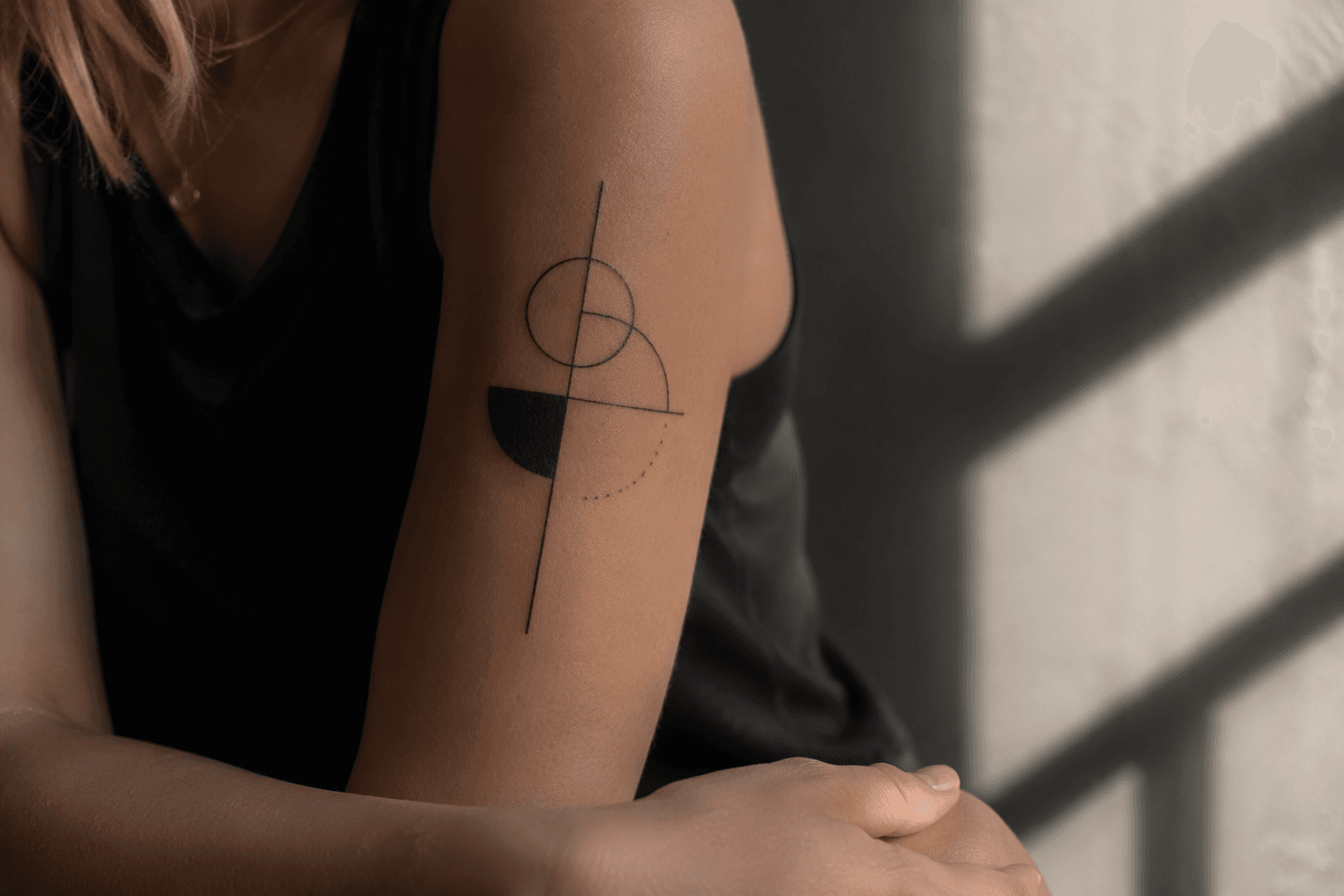
The strongest geometric tattoos are the ones edited down to essentials. Clean lines, negative space, and smart placement make the design read sharper and age better.
Why minimalist geometric tattoos work
The best minimalist geometric tattoos look disciplined, not busy. The trick is not adding more shapes, but cutting the design down until balance, spacing, and line hierarchy do the work.
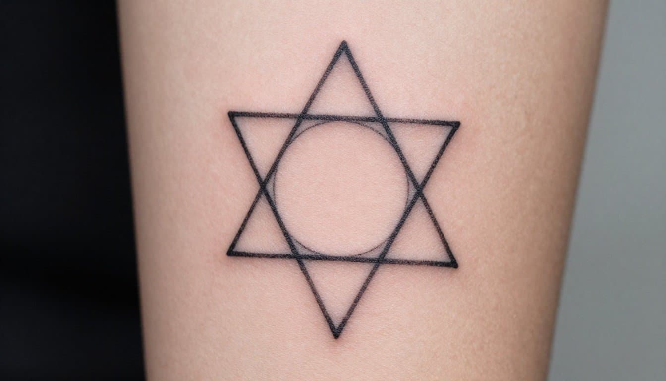
That is what makes this style feel so current. It skips decorative filler and leans on clean lines, intentional shapes, and negative space, which gives the tattoo room to read as deliberate body art instead of a rough sketch. A triangle, circle, or angular cluster can look almost plain on paper, but on skin the spacing between those elements becomes part of the design itself.
Editing is the real skill
Minimalist geometric work lives or dies by restraint. The article’s core point is simple: the strongest version is often the one that leaves the most out. That means fewer ornamental extras, less shading, and no unnecessary visual noise competing with the structure.
For an artist, that puts every decision under a microscope. Line weight has to be clean and consistent, symmetry has to be controlled, and the empty space needs to breathe without feeling accidental. If any of those pieces are off, the tattoo stops reading as geometric precision and starts looking unfinished.
Why negative space matters so much
Negative space is not a background in this style. It is active design language. In a minimalist geometric tattoo, the gaps around a shape are just as important as the lines that define it, because those gaps create clarity and keep the composition from collapsing into clutter.
That is why these tattoos often feel stronger when they are slightly more open than you expect. A circle sitting too close to a triangle, or an angular cluster packed too tightly, can lose the crispness that gives geometric work its edge. When the spacing is right, the tattoo feels deliberate from across the room and still holds up when you look closely.
Why these tattoos age better
One reason this style has real staying power is that it does not lean heavily on shading or ornamentation. There is less to fade unevenly, and fewer extras to blur into the skin over time. In other words, the design is doing more with less, which is exactly why it can stay legible for years.
That said, “ages well” is not a free pass. Tattoo ink is still exposed to the same real-world wear as any other tattoo, and ultraviolet light can fade it. The American Academy of Dermatology also notes that petroleum-based products can contribute to fading, which means aftercare is not a side note here. If the whole appeal is crisp linework and open space, then protecting those lines matters just as much as choosing them.
Placement is part of the composition
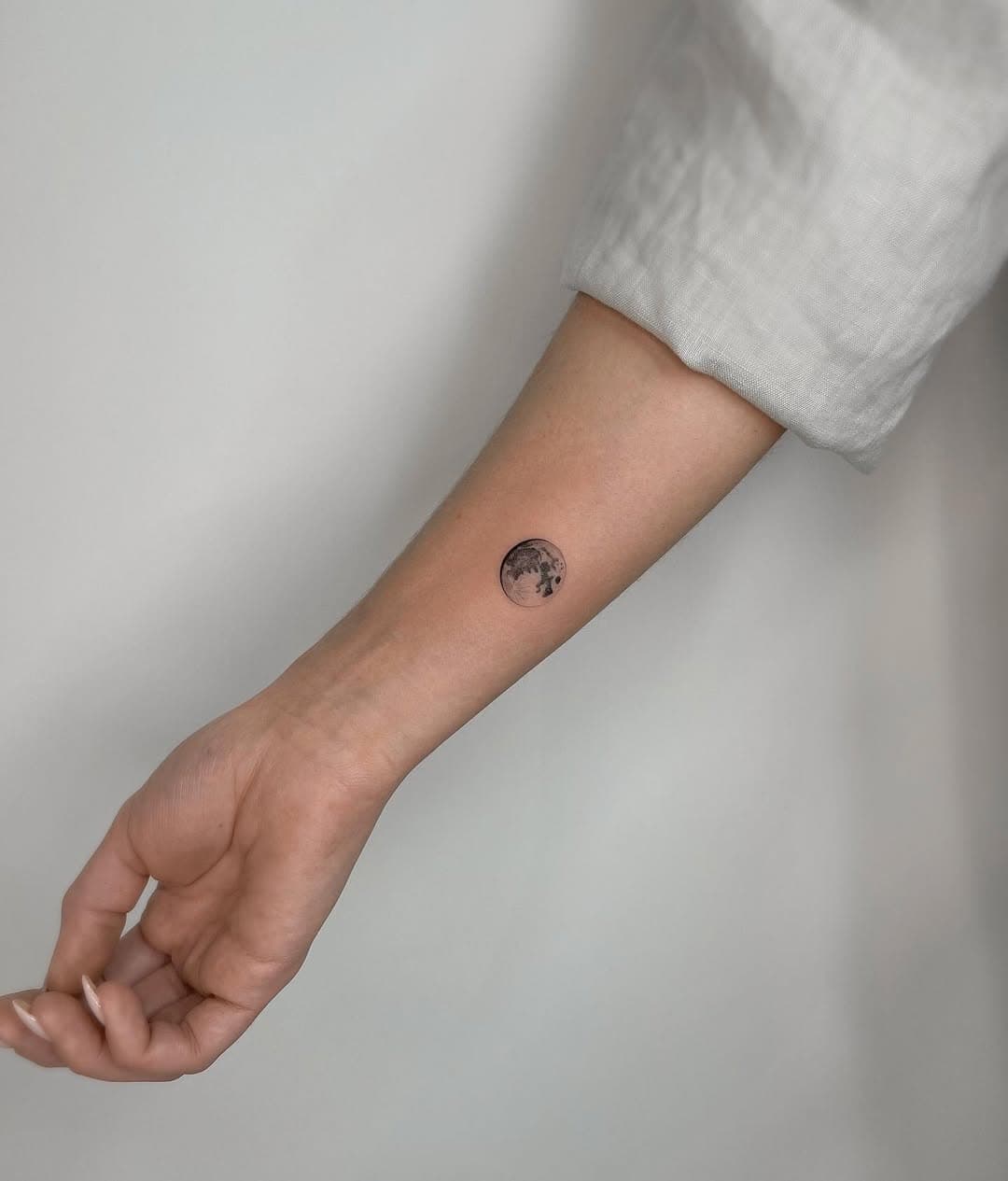
A minimalist geometric tattoo should be placed like a design object, not just an image dropped onto skin. The body’s curves change how a clean shape reads, so placement affects whether a triangle feels sharp, whether a circle stays balanced, and whether an angular cluster looks intentional or awkwardly crowded.
This is where a lot of people overcomplicate things. The stronger move is often to choose a simpler structure and let placement carry some of the visual interest. A small design in the right spot can feel more polished than a larger one packed with detail, especially when the artist understands how much breathing room the piece needs.
Questions worth asking your artist
If you are thinking about this style, the conversation before the tattoo matters almost as much as the tattoo itself. Ask practical questions, not vague ones.
- How will the line weight hold up at this size?
- Where does the negative space need to stay open so the design does not crowd itself?
- Will this placement keep the symmetry intact as my body moves?
- What parts of the design are most likely to soften over time?
- If I want to expand this later, how should the first piece be built so it still works as a standalone tattoo?
- What aftercare do you recommend to protect the crispest parts of the linework?
Those questions force the design to be judged as a tattoo, not just as a drawing. That distinction matters, because geometric tattoos look easy only when the editing has already been done well.
A modern look on an old craft
Tattooing itself is not new. It has existed for thousands of years across cultures around the globe, even if the minimalist geometric version is a more recent aesthetic. That history is part of what makes the style interesting now: it takes one of the oldest body arts and strips it down into something contemporary, restrained, and precise.
That modern appeal shows up in how people are wearing tattoos now. Statista reported in 2021 that 4% of Gen Z, 12% of millennials, 14% of Gen X, and 6% of baby boomers had one tattoo. It also found that multiple tattoos were especially common among younger adults, with 19% of Gen Z, 29% of millennials, 18% of Gen X, and 7% of baby boomers reporting more than one. Minimalist geometric work fits that shift because it can be a first tattoo that stays understated, or a small piece that later expands into a larger composition.
Sun care is part of the design choice
A clean geometric tattoo only stays clean if you treat it like something worth protecting. The American Academy of Dermatology says broad-spectrum, water-resistant sunscreen with SPF 30 or higher is the right call for tattooed skin when you are in the sun. That advice lines up with tattoo aftercare guidance noting that sun exposure can cause premature fading and cracking, and that ultraviolet radiation can prompt a healing tattoo to scar or scab over.
That is especially relevant for minimalist work. When a tattoo depends on crisp edges and open space, even mild fading changes the whole read of the piece. The more delicate the design, the less room you have for careless sun exposure.
Know the skin reaction side of the equation
There is one more reality check that belongs in any tattoo decision. Dermatology sources note that tattoos can trigger skin reactions immediately or weeks to years later, even when the work is done by a licensed artist and aftercare is followed. That does not make the style risky in some abstract way, but it does mean you should treat a tattoo as a skin decision as much as a visual one.
Minimalist geometric tattoos are appealing because they look calm, balanced, and clean. But that calm look is built on discipline: careful placement, strict line control, enough negative space to let the piece breathe, and aftercare that keeps the edges from going soft too soon. The real skill is still subtraction, and that is exactly why the best versions feel sharp long after flashier designs start to blur.
This article was produced by Prism’s automated news system from verified source data, official records, and press releases, then run through automated quality and moderation checks before publishing. The system is built and supervised by the people who set the standards it runs under. Read our full AI policy.
Know something we missed? Have a correction or additional information?
Submit a Tip