How to choose fonts that work in personalized jewelry
The font is the make-or-break choice in personalized jewelry: tiny surfaces can turn a loving message illegible, and the engraving method changes everything.
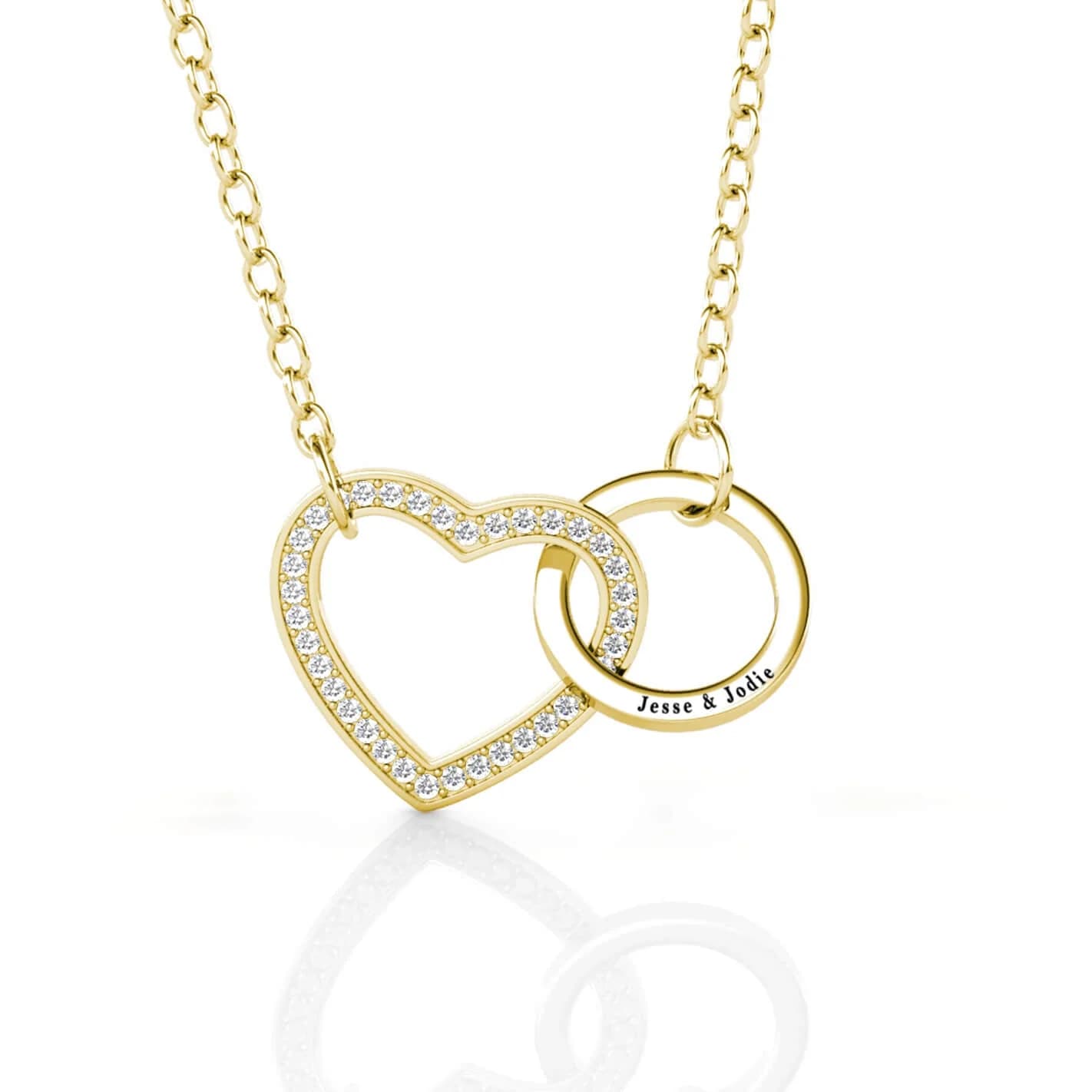
On rings, pendants, bracelets, charms, and clasps, the message may be permanent, but the surface is tiny, curved, and often polished enough to blur a delicate line. Font choice matters as much as the words themselves: it decides whether a name, date, or short phrase reads as jewelry or becomes a blur.
Small surfaces, big readability problems
Font is a design decision, not an afterthought. A delicate script can look beautiful in a rendering and then struggle on a narrow ring shank or a glossy pendant back, where fine strokes can crowd together or disappear. The same practical limit appears across IF SHE, Urban Nexus Store’s engraved disc jewelry guidance, and KLENOTA: the right personalization depends on the piece and the surface.
A ring band gives you a different canvas than a bracelet clasp, and a pendant back gives more breathing room than a charm.
Choose the font by the message
Different messages ask for different visual weights. Names can carry a little softness if the surface is generous, but initials often need stronger letterforms so the characters do not collapse into one another. Memorial dates and Roman numerals usually benefit from crisp, compact lettering, because the eye needs to read every stroke quickly and without strain.
Short phrases and symbols are a separate challenge because they compress a lot of meaning into very little space. A handwriting-inspired line may feel intimate, but on a curved or narrow surface the same script can become too fragile to read. That is where a slightly sturdier serif or block style can preserve the emotional tone without sacrificing legibility.
Script, serif, or block: what each one does on metal
Script fonts bring movement and romance, which is why they are so often chosen for names and sentimental notes. Their weakness is also their charm: the thin upstrokes and looping connectors can lose clarity when the engraving area is small or polished. If the piece has room and the message is short, script can look graceful; if the canvas is tight, it can quickly become ornamental in the wrong way.
Serif fonts sit in the middle ground. They keep a sense of refinement while offering firmer structure than a loose script, which makes them useful for dates, names, and compact phrases where readability matters more than flourish. Block letters are the clearest option of all, especially when the personalization is short and the surface is tiny. They do less visual dancing, but they survive small-scale engraving better than fonts that depend on fine hairlines or dramatic curves.
Match the font to the piece, not just the sentiment
A ring demands different judgment than a pendant. Inside a ring shank, every stroke has to work in a tight, often curved space, so stronger letterforms usually outperform ornate scripts. On a pendant back or a disc, the surface can give a font a little more air.
Bracelets and clasps add another layer of constraint because they move, bend, and catch light as they are worn. In those spots, clarity wins over embellishment almost every time. Charms sit somewhere in between: they can carry a meaningful word or date, but the smaller the charm, the more the font has to do with less room.
Laser engraving or hand engraving changes the result
The engraving method determines what the font can become. Laser engraving is shallow and precise, which makes it a strong fit for delicate scripts and fine fonts that rely on clean edges. Hand engraving creates a deeper, bolder impression and tends to favor stronger letterforms, which is why it often feels more tactile and emphatic on the finished piece.
Laser Marking Technologies says its jewelry laser marking systems make jewelry creation “faster and more precise,” and says it has been a leader in laser marking machinery since 2002. Laser personalization fits a modern, repeatable workflow built for detail. Gem Awards calls hand engraving one of the most intricate and laborious methods of engraving, and Jewel-Craft traces engraving back through millennia.
A practical way to decide
1. Look at the surface first. A curved ring, a narrow clasp, and a flat disc do not ask for the same font.
2. Decide what the message needs to do. Names and notes can carry softness; dates and initials usually need clarity.
3. Match the method to the mood. Laser gives precision and smaller detail; hand engraving gives depth and a bolder, more traditional finish.
This article was produced by Prism’s automated news system from verified source data, official records, and press releases, then run through automated quality and moderation checks before publishing. The system is built and supervised by the people who set the standards it runs under. Read our full AI policy.
Did this article answer your question?