Gender-neutral palettes gain ground in baby shower decor planning
Neutral, photo-friendly baby shower palettes are moving from niche to default, and the smartest paper choices keep the look polished without inflating the bill.

The new baby shower look is built on restraint
The easiest way to spot the shift is on the table itself. After years of watching what sells, Celebration Warehouse says three palettes keep moving: classic boy blues, soft girl pinks, and the rising winner, gender-neutral themes that nobody has to apologize for. That matters because the most visible part of planning has stopped being a fight over pink versus blue and started being a question of balance, contrast, and how the room photographs.
The broader market is already moving in that direction. Nordstrom now gives gender-neutral baby gifts and gender-neutral baby clothing their own real estate, while Minted sells gender-neutral baby shower invitations as a standard style option, not a novelty. The Bump reinforced that shift in 2025 with gender-reveal alternatives that let parents celebrate baby “without all the pink and blue,” which is exactly the kind of language that tells you the old code is losing its grip.
Start with the palette that matches the mood
The best color choice is no longer just about tradition. It is about whether the decor feels clean in person, reads clearly in photos, and avoids the nursery-by-default look that can make a celebration feel more like a room setup than a party. Celebration Warehouse’s guidance is practical here: the palette has to do some work, not just sit there looking cute.
The combinations that hold up best are straightforward:
- For a boy shower, navy or light blue anchored with white or cream, then finished with gold accents.
- For a girl shower, soft pink with ivory or white, warmed by rose gold or gold.
- For a gender-neutral shower, yellow, sage green, or cream, paired with white negative space and optional natural wood tones.
That last group is the one gaining the most traction because it avoids overcommitting to a single cue. Yellow brings cheer without shouting. Sage green feels current without drifting too earthy. Cream gives you room to build around florals, small patterns, or a simple typographic invitation without overloading the design.
Cardstock is where the budget either feels smart or sloppy
Color gets the attention, but cardstock decides whether the whole setup feels premium. In a category where people are comparing invitation suites, favor signs, and place cards side by side on camera, flimsy stock gives the game away instantly. A midweight to heavyweight cardstock is the sweet spot because it sits flat, holds shape in photo setups, and gives color enough body to look intentional rather than washed out.
A matte finish usually does more for baby shower decor than glossy coating ever will. Matte reads calmer, photographs more evenly, and keeps soft palettes from catching glare under indoor lighting. If you want one upgrade that feels expensive without becoming expensive, choose a heavier matte sheet for the main pieces and reserve specialty finishes for a single focal item, like the invitation front or the welcome sign.
The most cost-conscious premium look is usually built from a few simple moves:
- Use one strong base color and one lighter support color instead of printing every surface in multiple tones.
- Keep large areas of white space so the design can breathe.
- Use gold or rose gold as a narrow accent, not a full coverage effect.
- Match the paper texture across the suite so the invitation, signage, and small labels feel like one set.
That approach works especially well with the neutral palettes Celebration Warehouse is pushing, because cream, sage, and yellow all look more polished when they are not buried under too much ink.
Avoid the shades that flatten in photos
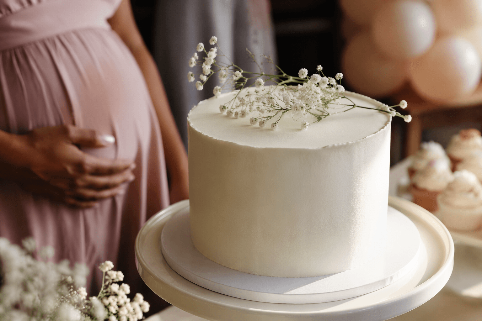
The biggest trap is not bad taste, it is colors that disappear. Celebration Warehouse specifically warns against pastels that are too pale because they can look washed out in photos. That is a real issue in baby shower decor, where the event lives on phones long after the last cupcake is gone. If the palette is too soft, the setup can lose shape, and all that planning ends up reading as beige blur.
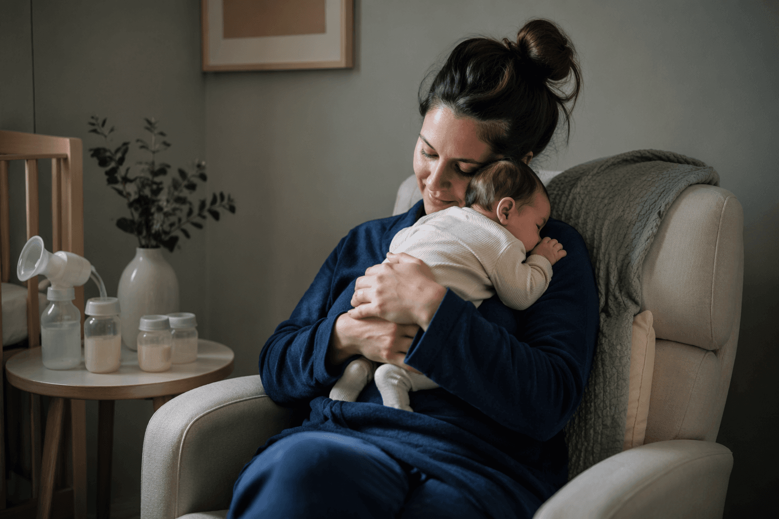
The second trap is leaning too hard into nursery decor. That may sound harmless, but it can make the shower feel like a room reveal instead of a celebration. The better move is to borrow nursery-adjacent colors without copying nursery styling. A sage backdrop, cream cardstock, and a few natural wood details feel grown-up enough for guests, while still keeping the baby focus clear.
Why retailers are treating gender-neutral as normal
The retail signal is hard to miss. Nordstrom’s gender-neutral baby gifts and baby clothing categories sit alongside the traditional ones, and Minted’s invitation assortment treats gender-neutral designs as part of the main event, not a side aisle. Even Minted’s more traditional baby-girl invitation language makes room for a modern co-ed shower and a surprise reveal, which is another sign that planning language has broadened.
That normalization changes how hosts shop. Instead of starting with the baby’s assumed color and filling in everything else, buyers are starting with the event mood and building the palette from there. That is why neutral schemes, cleaner typography, and flexible stationery are gaining ground. They work for couples who want a co-ed shower, for families who want to keep the reveal subtle, and for hosts who simply want decor that looks good in a living room, a backyard, or a restaurant private space.
The real shift is from theme-first to design-first
Baby shower decor is becoming more design-literate. People are thinking about photography, psychology, and how a room feels in real life, not just which color has always been used for which baby. That is a healthy change for the category, because it rewards good composition over cliché and makes it easier to host a celebration that feels current without being costly.
The strongest showers now use color as structure, cardstock as the finishing move, and negative space as a design tool. That is why neutral palettes are winning ground: they are easier to tailor, easier to photograph, and easier to make look considered. Pink and blue are not gone, but they are no longer the only languages the room knows.
This article was produced by Prism’s automated news system from verified source data, official records, and press releases, then run through automated quality and moderation checks before publishing. The system is built and supervised by the people who set the standards it runs under. Read our full AI policy.
Did this article answer your question?