Original notes unchanged
WK Kellogg is moving cereal's protein story out of the nutrition panel and onto the box. SPOONS is a shelf-level attempt to make classic cereal look credible again.
WK Kellogg is trying to do something cereal has needed for a long time: make its nutrition case obvious at a glance. With the national rollout of SPOONS, the company is putting fiber, protein, and single-digit sugars on the front and back of packs across core brands, betting that clearer shelf communication can change how shoppers read the category.
What WK Kellogg is actually changing
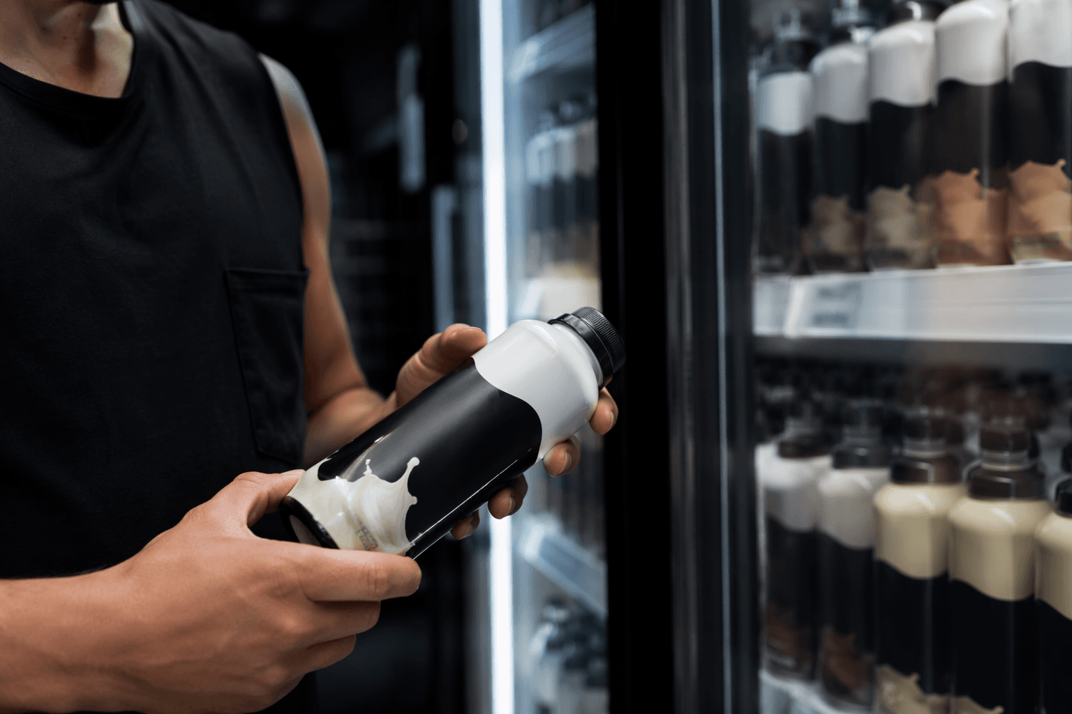
SPOONS is not a new cereal, a reformulation, or a flavor launch. It is a packaging framework designed to help shoppers identify, understand, and choose cereals based on nutrition priorities, and WK Kellogg is applying it across classic labels including All-Bran, Corn Flakes, Frosted Mini-Wheats, Raisin Bran, and Rice Krispies. The company says the new information will show up on the back of boxes, while front and back panels will call out the attributes it wants consumers to notice first.
That matters because the execution is meant to simplify a category that often asks shoppers to do too much decoding. WK Kellogg says SPOONS was tested with consumers, who responded positively to the simplicity, fiber content, and single-digit sugars messaging. Sarah Ludmer, the company’s chief well-being and sustainable business officer and the architect of SPOONS, is the internal proof point here: the company is not just decorating boxes, it is trying to standardize how the brand explains itself.
Why protein is the sharpest part of the pitch
The most interesting part of SPOONS is the P. WK Kellogg says cereal and milk together create an easy way to bring grains and protein into the same bowl, and the company goes further, claiming a bowl of cereal and milk can have as much, or more, protein than an egg. That is a strong, simple comparison, and it is clearly designed to move cereal from “carb-heavy breakfast” toward something that can sit in the protein conversation.
But WK Kellogg is not relying on protein alone. It is pairing that message with other hard nutrition cues: more than 140 options that are at least a good source of fiber, with 3 to 17 grams per serving, and a portfolio where nearly half the cereals have 10 grams or less of added sugar per serving. In other words, protein is the hook, but fiber and sugar control are what make the pitch feel credible rather than opportunistic.
The rest of the acronym is doing supporting work too. The company says 75% of its cereals are simply puffed, toasted, flaked, or shredded, which reinforces the “simple ingredients” story. It also frames cereal as a vehicle for bringing whole grains, fruit, dairy, and other foods into one meal, plus vitamins and minerals such as iron, folate, calcium, and vitamin D. That is a broader wellness argument, not just a protein claim.
Why packaging is the battleground
WK Kellogg is making this move in a category that has been under pressure for years. In first-quarter 2025, the company said its organic net sales fell 5.6% on an 8.6% drop in volume, while the overall U.S. ready-to-eat cereal category saw a 0.8% decline in dollar sales and a low single-digit volume dip. At the same time, granola, natural and organic cereal, and health-forward cereal brands posted double-digit growth, which tells you exactly where consumer attention is going.
That trend explains the packaging strategy. Gary Pilnick, WK Kellogg’s chairman and CEO, said the company sees increased focus on health as a positive for the category and for WK Kellogg, and he tied SPOONS to broader efforts that include reallocating media spend, refreshing the Kashi commercial plan, and bringing the framework to life through new campaigns on mainstream brands. The message is clear: if cereal is going to win back relevance, it has to look like a better-for-you choice before a shopper ever flips the box over.
There is also a longer brand-story angle here. WK Kellogg says cereal has been in American kitchens for more than 120 years, and SPOONS is meant to reintroduce a familiar food to consumers who now want more from breakfast. That is why the company is leaning on a dietitian-led framework and consumer-tested language instead of a vague wellness halo. In a crowded aisle, nostalgia alone does not sell; it has to be translated into a nutrition story that can survive scrutiny.
Can packaging really reposition cereal as protein-relevant?
Packaging can absolutely change perception, but only up to a point. SPOONS is smart because it reduces friction: it gives shoppers a fast read on protein, fiber, sugar, and ingredient simplicity without making them work through the nutrition panel. In that sense, it is a practical shelf tool, not just a branding exercise.
The limitation is just as clear. A front-of-pack cue can sharpen the story, but it cannot carry the whole category if the underlying product proposition feels thin. WK Kellogg is trying to make cereal feel relevant to protein-first shoppers by leaning on the cereal-plus-milk combination, but that only lands if consumers accept the serving reality and see the rest of the nutrition profile as worth the tradeoff. That is why the strongest version of SPOONS is not “cereal is protein food”; it is “this is a balanced bowl with protein, fiber, and lower sugar that is easy to understand quickly.”
On shelf, that distinction is everything. If WK Kellogg keeps the message tight, the packaging can help cereal look less like a sugary relic and more like a functional breakfast base. If the proposition gets stretched too far, the box becomes louder than the product, and shoppers will notice that immediately.
This article was produced by Prism’s automated news system from verified source data, official records, and press releases, then run through automated quality and moderation checks before publishing. The system is built and supervised by the people who set the standards it runs under. Read our full AI policy.
Know something we missed? Have a correction or additional information?
Submit a Tip