Why Gantt charts are not always the best project view
Gantt charts still matter when dependencies are tight, but monday.com’s own stack shows why many teams need Kanban, timelines, workload, or dashboards instead.

Henry Gantt designed and popularized the Gantt chart around 1910 to 1915, and it is still useful, just not universal. For work that depends on a fixed sequence of handoffs, Gantt charts can show the schedule, the dependency chain, and where a plan is slipping, but they become a bad default the moment priorities shift faster than the chart can be maintained.
When Gantt charts still earn their keep
A Gantt chart is one of the oldest visual tools still hanging around in modern software. It is good at mapping dependencies and showing current schedule status in one place, especially when one task cannot move until another finishes. For teams managing launches, migrations, or customer implementations with locked dates and hard dependencies, that kind of visibility still beats a free-form task list.
Project management itself did not really become a recognized discipline until the 1950s. A lot of the familiar project view logic we still use was built for a more stable world, where plans could be organized well in advance and then followed with limited change. Modern software work is less obedient than that, which is why a tool designed for sequencing can start to feel brittle when the work is moving too quickly.
Why teams drift away from the chart
Teams turn away from Gantt charts when they are too complex, people avoid using them, and they fail to match how work actually flows. When a view takes more effort to maintain than the insight it provides, teams start updating it less often, which means the chart becomes a record of old intent instead of a live operating tool.
The problem gets sharper once a project leaves the planning stage. Priorities change, stakeholders want a simpler readout, and the chart can become rigid exactly when the work needs flexibility. A product manager tracking a release, an implementation lead coordinating customer onboarding, or an engineer working through dependencies all need different levels of visibility, and forcing every one of them into the same heavy planning view creates friction instead of clarity.
That is also why the most familiar view is often the least adaptive. A Gantt chart can be a strong planning artifact, but if the team is in daily triage mode, the same view may bury the next actionable step under a wall of bars and dates.
Pick the view that matches the work
monday.com has more than 250,000 customers worldwide, and its platform supports Gantt, Kanban, Timeline, Workload, and other views in one place. The platform is designed to let teams switch visual language as the work changes, rather than forcing every department to speak in the same planning format.
Different views answer different questions:
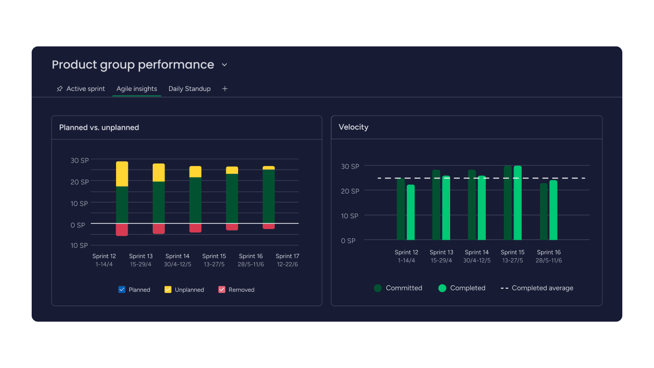
- Gantt works best when dependency-heavy planning matters and the schedule itself is the main risk.
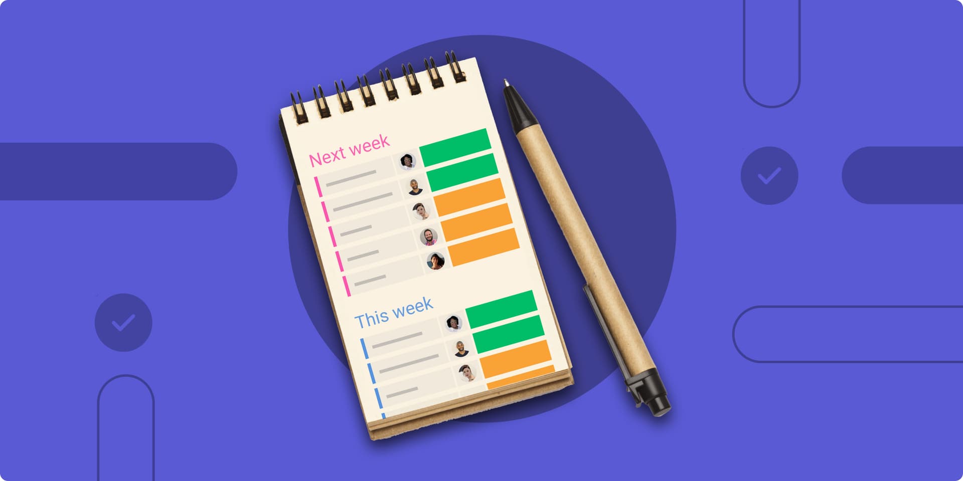
- Kanban is better when the work is flowing from one stage to the next and the team needs to see what is moving, blocked, or waiting.
- Timeline is better when deadlines matter, but the team does not need the full dependency map that a Gantt chart brings.
- Workload is the better choice when capacity planning is the problem, because the question is who can actually take on more work.
- Dashboards make more sense for executive reporting, where leadership needs a high-level picture that can be absorbed quickly.
Users can import from Excel and view work as Gantt charts, which is useful for teams that start in spreadsheets and need a more live operating view once the work is underway. The Gantt chart is usable either as a board view or as a dashboard widget.
What this means for monday.com teams
For monday.com employees, this is a product strategy issue. The company’s value proposition has always been tied to flexibility and visual clarity, so the question is not whether Gantt charts belong in the product. The question is whether the platform gives teams enough visual choice to match the work, the team, and the audience looking at it.
That matters to product managers deciding how to present planning versus execution. It matters to engineers who need dependencies without excess process. It matters to implementation teams that need to show customers progress without building a maintenance burden into every project board. It also matters to sales professionals, because the platform’s story to buyers is stronger when it reflects how different teams actually work, not when it treats one project view as the universal answer.
The commercial backdrop is worth remembering too. In its fourth-quarter 2025 results, monday.com reported revenue of $333.9 million, full-year 2025 revenue growth of 27%, and customers with more than $50,000 in annual recurring revenue representing 41% of total ARR.
This article was produced by Prism’s automated news system from verified source data, official records, and press releases, then run through automated quality and moderation checks before publishing. The system is built and supervised by the people who set the standards it runs under. Read our full AI policy.
Did this article answer your question?