Geometric Tattoos Blend Precision, Florals, Symbols, and Personal Meaning
Geometry lasts when the motif, placement, and scale all work together. The strongest pieces make florals, symbols, and names look intentional, not crowded.
Why geometric tattoos work when the structure is right
Geometric tattooing looks simple until you try to place it on real skin. The best pieces balance precision and softness, which is why a black-and-grey floral forearm tattoo, birds built from bold shapes, or a wrist design that folds in a tree, celestial elements, and family names can all live under the same umbrella without feeling alike.
That range is the point. Roughly 30% to 44% of American adults have tattoos, so this is not a fringe visual language anymore. It is a mainstream design choice, and the people who get it now are usually looking for something that can carry meaning without losing its shape after the first year.
Start with the motif, not the math
A geometric tattoo lasts best when the subject fits the structure. Floral work with ornamental symmetry tends to read cleanly because petals, curves, and mirrored repeats already lend themselves to pattern. That is why the Jerwood Visual Arts gallery’s black-and-grey floral forearm piece feels controlled rather than busy, while the larger flower leg piece can breathe because the scale gives the details room.
Birds in flight are a different case. Built from bold shapes, they work when you want motion and clarity, not microscopic detail. The same goes for a heart-DNA forearm tattoo with subtle red accents: the concept is personal and specific, but the design still depends on a strong silhouette and limited color so the geometry stays readable.
More symbolic pieces need even more discipline. A face-and-mindfulness concept that uses abstract structure to carry a word-based message only works if the lettering and geometry are balanced, not competing for attention. The wrist tattoo that merges a tree with celestial elements and family names shows how far the style can stretch, but it also proves the rule: once you start layering meaning, the composition has to stay organized or it turns into visual noise.
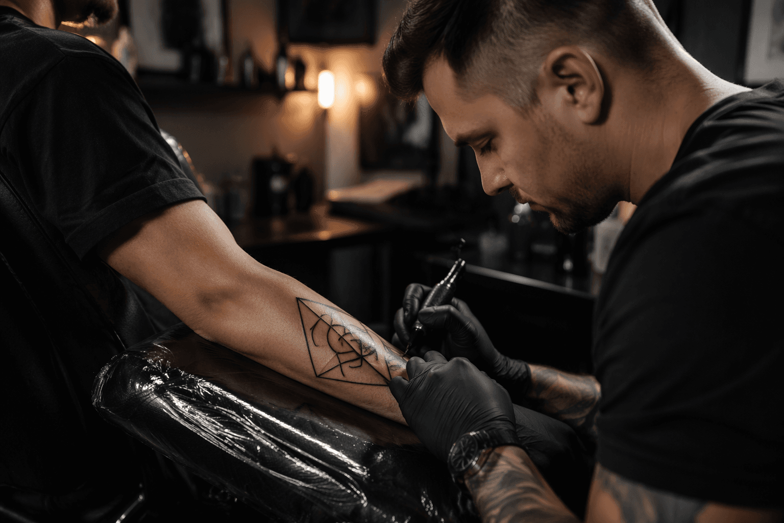
Placement changes the entire read
Where you put the tattoo changes how geometric work behaves every day. Forearms are one of the easiest places to make this style look intentional because the skin is relatively flat and the design can run with the arm instead of fighting it. That makes forearm florals, negative-space compositions, and symbolic hybrids easier to keep crisp.
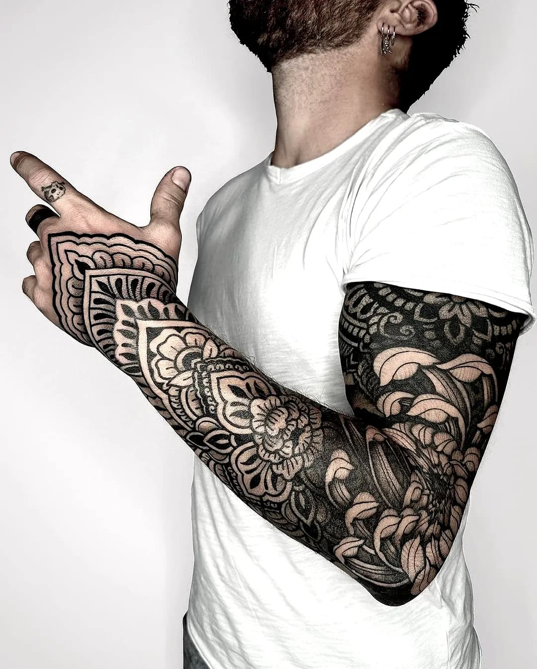
Hands, necks, wrists, and the upper chest are more demanding. A hand piece that leans toward tribal snowflake geometry can look sharp, but it sits in a high-movement, high-wear area where details are more likely to soften over time. Neck-and-upper-chest work has the same problem in a different way: it reads instantly, but the area is more exposed and less forgiving if the design is too delicate.
Legs can be a strong canvas when you want scale. The larger flower example works because the longer surface gives the artist space to build symmetry without crowding the linework. If you want a tattoo that still feels intentional years later, think about how the body part moves, stretches, and catches sunlight before you fall in love with the stencil.
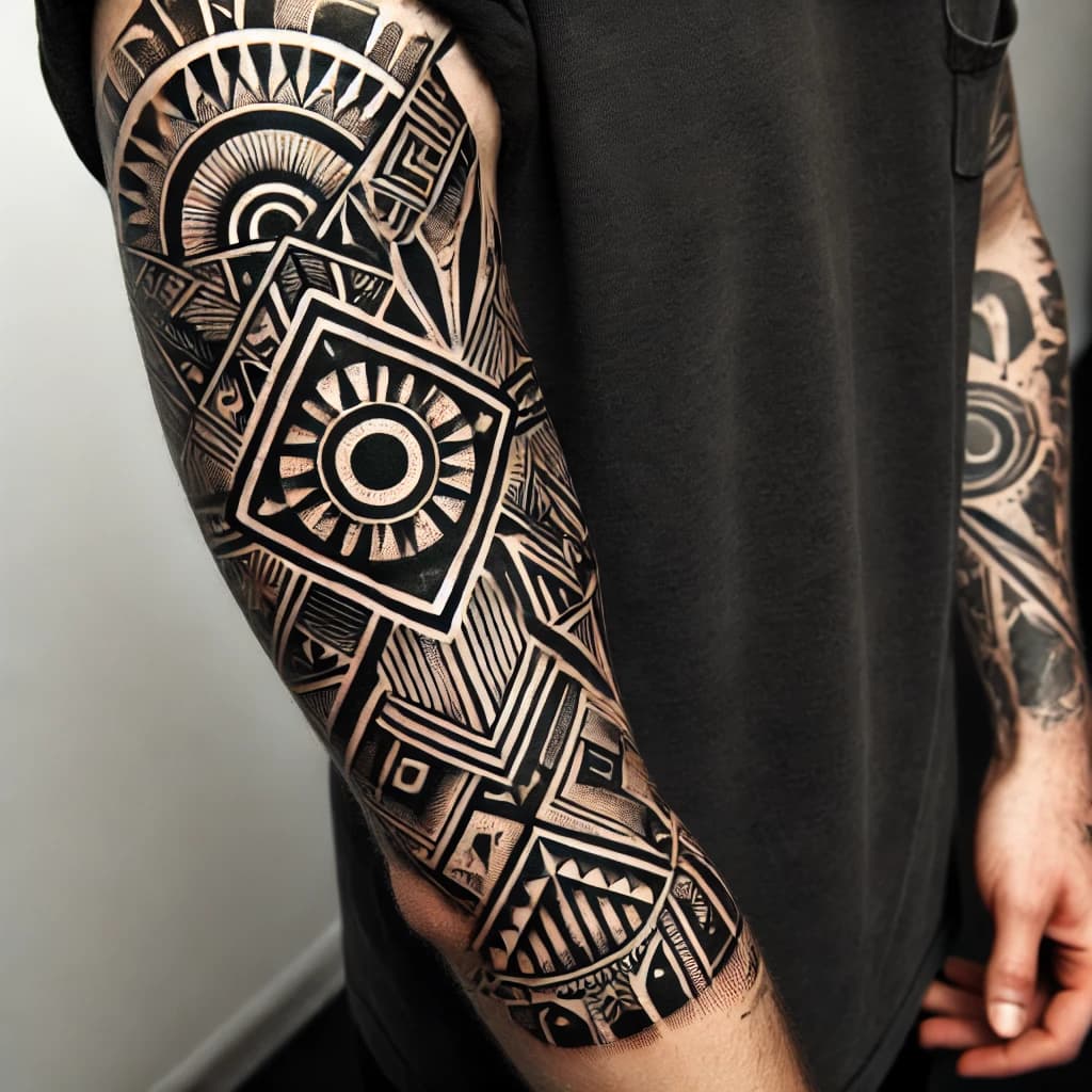
Complexity is a tradeoff, not a flex
The most durable geometric tattoos usually understand restraint. Heavy black against skin, crisp edges against soft shading, and rigid structure against organic forms all age better than overpacked detail. A negative-space arm design is a good example of that logic: it lets skin do part of the work, so the image does not depend on every line surviving perfectly forever.
That is where people often overreach. Tiny line grids, crowded dotwork, and dense symmetry can look incredible on paper, but once they are wrapped around a moving limb, the design needs breathing room. If the tattoo has to be read from a distance, the geometry should be bold enough to survive the distance.
Color should be used with the same discipline. The heart-DNA piece with subtle red accents works because the color acts like punctuation, not decoration for its own sake. In geometric tattooing, a small controlled accent can age better than a lot of saturated color fighting with fine structure.
Why sacred geometry and ornamental work still matter
This style did not appear out of nowhere. Tattoodo describes geometric tattoos as a category that includes sacred geometry, dotwork patterns, mathematical shapes, and symmetrical compositions. Its ornamental tattoo guide connects the look to mandalas, mehndi-inspired patterns, and sacred geometry, which explains why so many pieces feel both modern and rooted.
That lineage shows up in the artists who helped define the style. Inked has identified California artist Dillon Forte as one of the leading tattooers in sacred geometry, while Thomas Hooper’s work draws on nature, mathematical and geometric patterns, cosmology, and eastern religious images. Those references matter because they show geometric tattooing as a living framework, not a passing aesthetic.
What to ask before you book
The practical questions are simple, and they matter more than trend language:
- Will this motif still read clearly if it stretches over curved skin?
- Is the design strong enough to handle hand, neck, or wrist placement?
- Does the composition rely on tiny detail, or can it survive as bold shape and spacing?
- Are aftercare instructions clear about cleansing, moisturizing, and sun protection?
That last point is not optional. Dermatology guidance emphasizes aftercare, and the Centers for Disease Control and Prevention has documented tattoo-associated nontuberculous mycobacterial skin infections, including cases tied to ink diluted with nonsterile water. Some aftercare instructions still miss basic hygiene guidance and when to seek medical care, so the responsibility does not stop when you leave the chair.
A good geometric tattoo does not just look precise on day one. It stays legible, balanced, and personal as the skin around it moves through real life. That is the difference between a design that feels trendy and one that still looks deliberate years later.
This article was produced by Prism’s automated news system from verified source data, official records, and press releases, then run through automated quality and moderation checks before publishing. The system is built and supervised by the people who set the standards it runs under. Read our full AI policy.
Did this article answer your question?