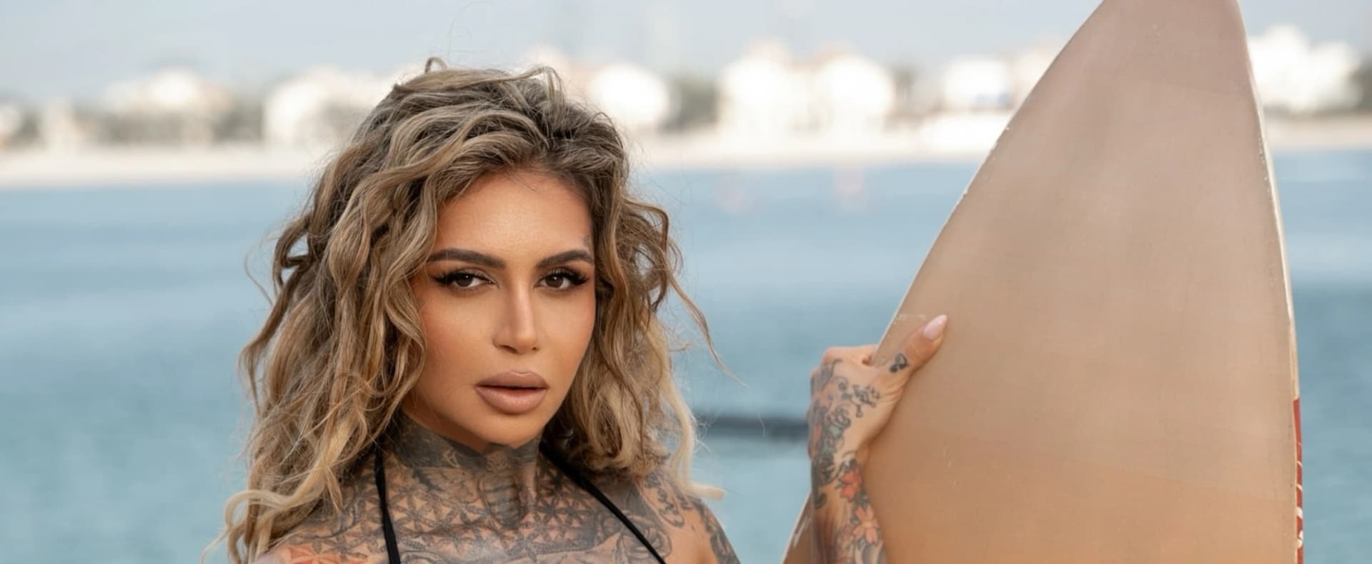
Mina Mendes’ tattoos define her identity across modeling, esports, streaming
Mina Mendes turns tattoos into a moving identity system, and the lesson is clear: symmetry, restraint, and contrast make ink read like a brand, not background noise.
Tattoos as the point, not the backdrop
Mina Mendes is the kind of public figure who makes tattoos do real work. On a Germany-based international model, fitness influencer, and esports entrepreneur who moves through Europe, the United States, Asia, and Africa, the ink cannot afford to feel random. It has to read as part of the package, and in her case that package is performance, branding, and visual consistency.
What makes her stand out is that the tattoos are described as her most personal reflection, not a styling afterthought. That is the key lesson here for anyone who cares about geometric, fine-line, or minimalist body art: when a person is constantly photographed, streamed, and circulated, the tattoo language has to stay coherent under pressure.
Why her image reads like a curated system
Mendes’ career spans more than one lane, and that is exactly why her tattoo presence matters. She is not just posing for fashion images. She is operating as a model, a fitness figure, an esports entrepreneur, and a digital personality whose identity travels between studios, streams, events, and international work.
That kind of mobility changes how tattoos function. Instead of acting like a single statement piece, they become part of a broader visual shorthand. The profile around her makes that clear by placing tattoos alongside movement, adaptability, and self-definition, which is a very different read from the usual model feature that treats ink like decoration.
For geometric readers, that is the useful angle. The strongest body-art identities do not depend on one dramatic tattoo. They depend on repetition, restraint, and a clear visual logic that survives every outfit, camera angle, and platform.
What geometric readers can learn from the curation
Mendes is not presented as a tattoo tutorial, but her image still offers a practical lesson in curation. When ink is part of a public brand, the most important decision is not just what to get. It is how the pieces relate to each other across the body.
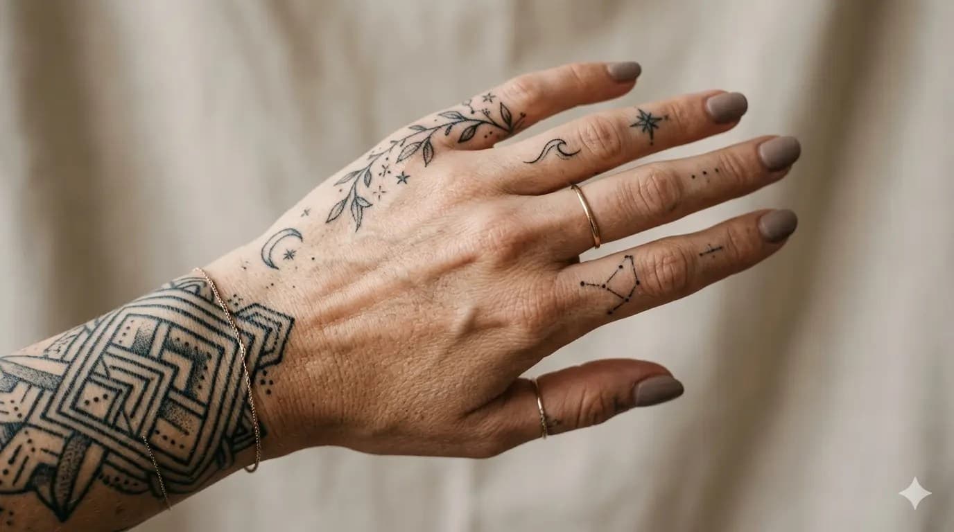
That is where geometric and ornamental thinking comes in. Geometric tattoos are loved for the way they create balance, symmetry, and a little mystery, and they often work best when the placement feels deliberate rather than crowded. Minimalist placements can make a lot of ink feel cleaner, while dense work needs enough negative space to keep the whole composition legible.
Placement
Placement is what separates a collection of tattoos from a visual identity. If the goal is to make extensive ink feel intentional, the body has to be treated like a layout, not a scrapbook. That means letting some areas breathe, grouping related forms, and resisting the urge to scatter pieces everywhere just because space is available.
Density and contrast
Density matters just as much as placement. A heavily tattooed public figure can look chaotic if every area competes for attention, but the right balance of filled and open skin turns the whole presentation into something readable. Contrast does the same job. Black shading, clean negative space, and controlled line weight help the eye understand where to land.
Line quality
Fine-line tattoos fit naturally into this conversation because the style is built around thin-as-thread linework and is currently on-trend. In a look like Mendes’, thin lines can keep the overall presentation sharp and modern instead of heavy. That kind of line quality is especially useful when the tattoos have to hold up across fashion imagery, fitness shots, and camera-first platforms.
Why streaming changes the equation
Mendes’ Twitch presence raises the stakes even more. Her bio says, “I host online & Lan Tournaments Call of Duty, Co owner of esports org @Aw0babobs, passionate Cod and Fortnite streamer.” That is not a side note. It places her in a space where the body is constantly on screen, often in motion, and often framed by a live audience.
That matters because streaming rewards visual consistency. When someone hosts tournaments, plays Call of Duty and Fortnite, and represents an esports organization at the same time, the tattoos are not just visible in still images. They become part of a repeatable on-camera identity. In that context, a coherent tattoo language has to survive lighting, compression, and fast movement.
It is also why ornamental tattooing fits the conversation so well. Ornamental work emphasizes geometry, symmetry, black shading, and delicate pointillism, which are all tools for making body art feel designed rather than piled on. Those qualities help tattoos read as part of a larger system, especially when the person wearing them is building a public-facing brand across multiple industries.
The real lesson in building a tattoo identity
Mendes’ image shows how tattoos can move from subculture signal to personal branding language without losing meaning. That is the part geometric readers should pay attention to. The goal is not to have the most ink. The goal is to make every piece feel like it belongs to the same visual sentence.
If you want a tattoo aesthetic that reads as deliberate, her example points to a few simple rules:
- Keep the line language consistent enough that the body feels unified.
- Use symmetry or mirrored balance where it strengthens the overall composition.
- Leave negative space on purpose so the eye has room to rest.
- Let blackwork, fine-line, and ornamental detail support each other instead of fighting for attention.
- Think about how the tattoos will look in motion, under lights, and on camera, not just in a mirror.
That is what makes the Mina Mendes story useful beyond celebrity coverage. Her tattoos are not framed as noise. They are part of how she is recognized, and in a world built on images, that is exactly how body art becomes identity.
Know something we missed? Have a correction or additional information?
Submit a Tip