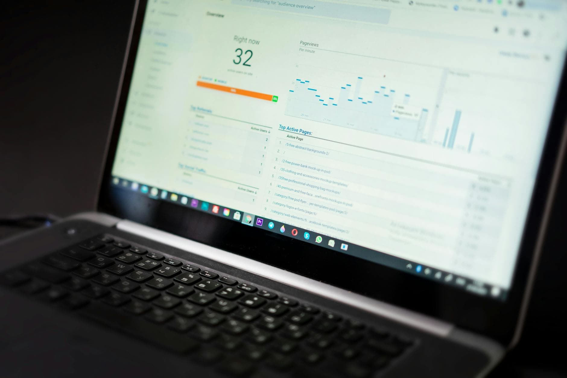
Monday.com dashboard links feature adoption, sprint speed, revenue impact
monday.com’s own playbook says the best dashboard is not a status board, it is a decision tool that ties feature use, sprint pace, and revenue into one view.

A dashboard that only counts tickets and closed tasks is easy to admire and hard to use. The real test is whether it helps a product team decide what to build next, what to stop building, and whether the work is actually moving customers and revenue in the same direction.
Why this dashboard matters now
That distinction matters inside monday.com because the company is no longer a scrappy work-management startup with a single product story. It says it serves more than 250,000 customers worldwide, reported 27% revenue growth in 2025, and finished the year with a 14% non-GAAP operating margin. In the fourth quarter alone, revenue reached $333.9 million, up 25% year over year, while customers with more than $50,000 in ARR represented 41% of total ARR.
For a company that reached $1 billion in annual recurring revenue in August 2024, roughly a decade after launching Work OS, the question is no longer whether teams are busy. It is whether product investment is translating into adoption, retention, and expansion. When new products already account for more than 10% of total ARR, a dashboard that can connect shipping activity to business impact becomes a management necessity, not a nice-to-have.
What a useful product dashboard should actually answer
The strongest version of a product management dashboard does three things at once. It shows whether a feature is being used, whether the team is shipping at a sustainable pace, and whether the work is helping the business move in the right direction. That means pulling together feature adoption, sprint velocity, customer satisfaction, and revenue impact in one place instead of splitting the truth across spreadsheets, slides, and private team trackers.
For product managers, that turns the dashboard into a prioritization tool. If a feature ships but adoption stalls, the question changes from “Did we launch it?” to “Did it solve a real problem?” For engineering, the value is visible progress without constant manual reporting. For sales and customer-facing teams, the same dashboard creates a shared language for product maturity, launch readiness, and customer outcomes.
The payoff is simpler than the software jargon suggests: if everyone is looking at the same numbers, fewer decisions get lost in interpretation. If each function keeps its own version of reality, the company wastes time debating facts instead of acting on them.
How monday dev bakes that logic into the workflow
monday.com is already pushing this idea into monday dev, where the Product Team solution includes boards, dashboards, and templates for managing backlog, collecting feedback, aligning goals, and documenting product requirements in one place. That matters because the dashboard is not sitting outside the workflow as a reporting layer. It is embedded in the operating system teams use to plan, ship, and review work.
Its sprint-management materials point to velocity charts, planned-vs.-unplanned charts, Agile Insights, and engineering performance dashboards. Those are not cosmetic metrics. Velocity charts help teams forecast future performance, while planned-vs.-unplanned views show whether the sprint is being consumed by interruptions that make delivery less predictable. Agile Insights and engineering dashboards are there to compare outcomes against the original goal, which is the only way to know whether output is sustainable or just noisy.
That is the real shift here. A dashboard should not simply show that work happened. It should show whether the work was disciplined enough to matter.
The practical litmus test for your current dashboard
If your dashboard cannot support a prioritization conversation, it is probably just a reporting board with better colors. A useful one should answer these questions quickly:
- Can you tell whether a feature is actually being used, not just whether it shipped?
- Can you see whether sprint velocity is steady enough to forecast the next release without guesswork?
- Can you separate planned work from interruptions so you know if the team is being forced into churn?
- Can you connect a launch to revenue signals such as expansion, new product contribution, or larger customer tiers?
- Can sales, product, and engineering all point to the same numbers in a customer conversation?
If the answer to those questions is no, the dashboard may still be tracking activity, but it is not helping the team make decisions. That is where many fast-scaling SaaS companies get trapped. The bigger the organization gets, the easier it is for assumptions to multiply. A dashboard is one of the simplest ways to keep everyone grounded in the same metrics.
What the customer examples say about the business value
monday.com’s own customer stories make the business case more concrete. Chinburg Properties said it saved more than 5,850 hours annually, recovered over $200,000 in productivity, and achieved a 6x ROI after centralizing dashboards and automating reporting. Unilever International said it saved 1,830 hours a year and reached more than 95% adoption across the core team while coordinating work across 120+ countries. McDonald’s Australia said it saved 1,224 hours per month, the equivalent of adding seven full-time employees, and generated a 6x return on investment.
WHSmith offers a different but equally telling example. It said it can pull a report 20 minutes before a meeting and trust it because the data is real-time. That is the point where dashboards stop being administrative tools and start becoming decision infrastructure. Fewer manual updates, fewer reconciliation meetings, and fewer arguments about whose numbers are right.
What this means for monday.com teams
Inside monday.com, this approach has a direct cultural fit. The company’s growth depends on turning execution into measurable customer value, not just shipping more features. Engineers benefit when they are not forced into constant status updates. Product managers get a clearer view of whether launch decisions are paying off. Sales and customer teams get a cleaner story about readiness, adoption, and expansion.
The broader lesson is that dashboard design is really prioritization design. A dashboard that links feature adoption, sprint speed, and revenue impact helps a company reward outcomes instead of output. At monday.com, where new products, AI adoption, and customer expansion are now part of the same growth story, that is the difference between managing work and managing the business.
Know something we missed? Have a correction or additional information?
Submit a Tip