monday.com updates dashboard guide to tackle scattered work data
Most organizations juggle more than 40 apps, and monday.com is recasting dashboards as the shared truth layer that keeps teams aligned.
Why dashboards are becoming a trust tool
More than 40 applications can feed the average organization, and that is exactly where reporting gets messy: project health lives in one place, budget status in another, and campaign performance somewhere else. monday.com’s updated dashboard template guide, refreshed on May 24, 2026, treats that sprawl as a daily trust problem, where teams lose alignment when they cannot see the same numbers at the same time. For monday.com employees, especially product, engineering, and sales teams, that is more than a content update. It is a clear statement about the coordination problem the platform is supposed to solve.
The guide’s central message is that dashboards are not just prettier reports. They are pre-built layouts tied to live data, designed to replace manual compilation with real-time visibility. That framing fits monday.com’s broader push to position itself as an “AI work platform” that turns strategy into execution, not just a place to store updates after the work is already done.
What the template guide is really teaching
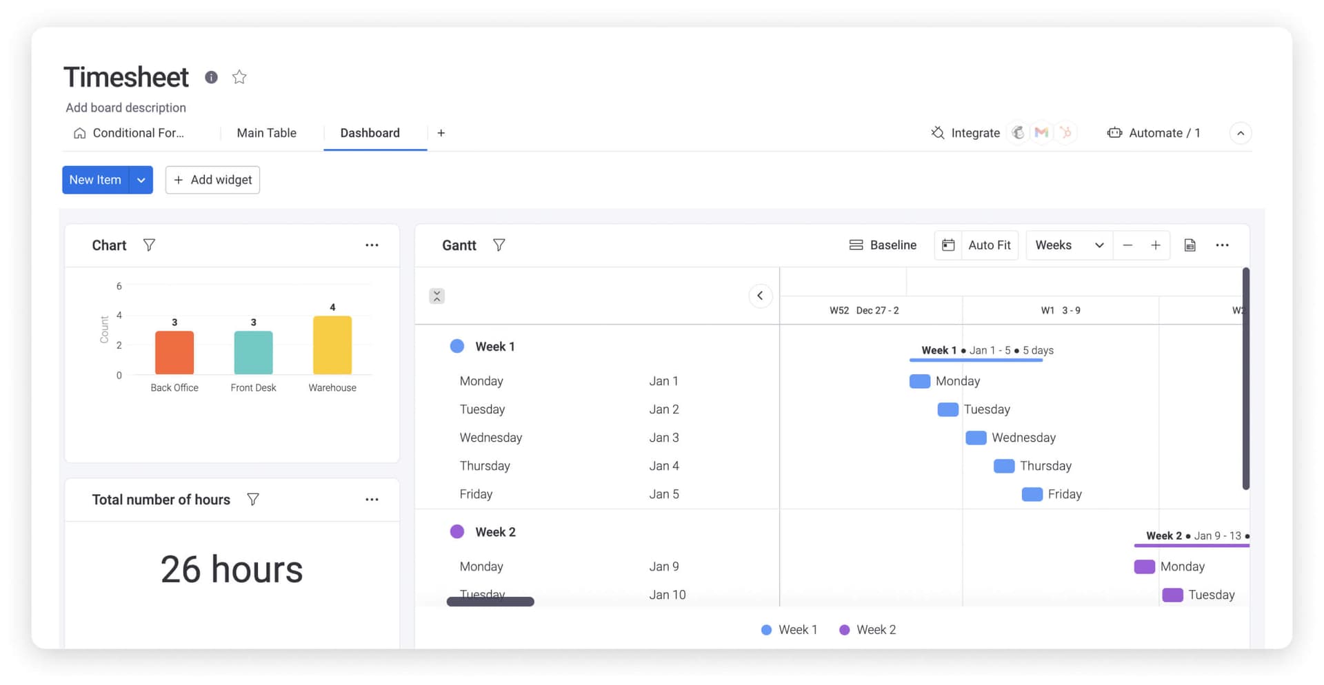
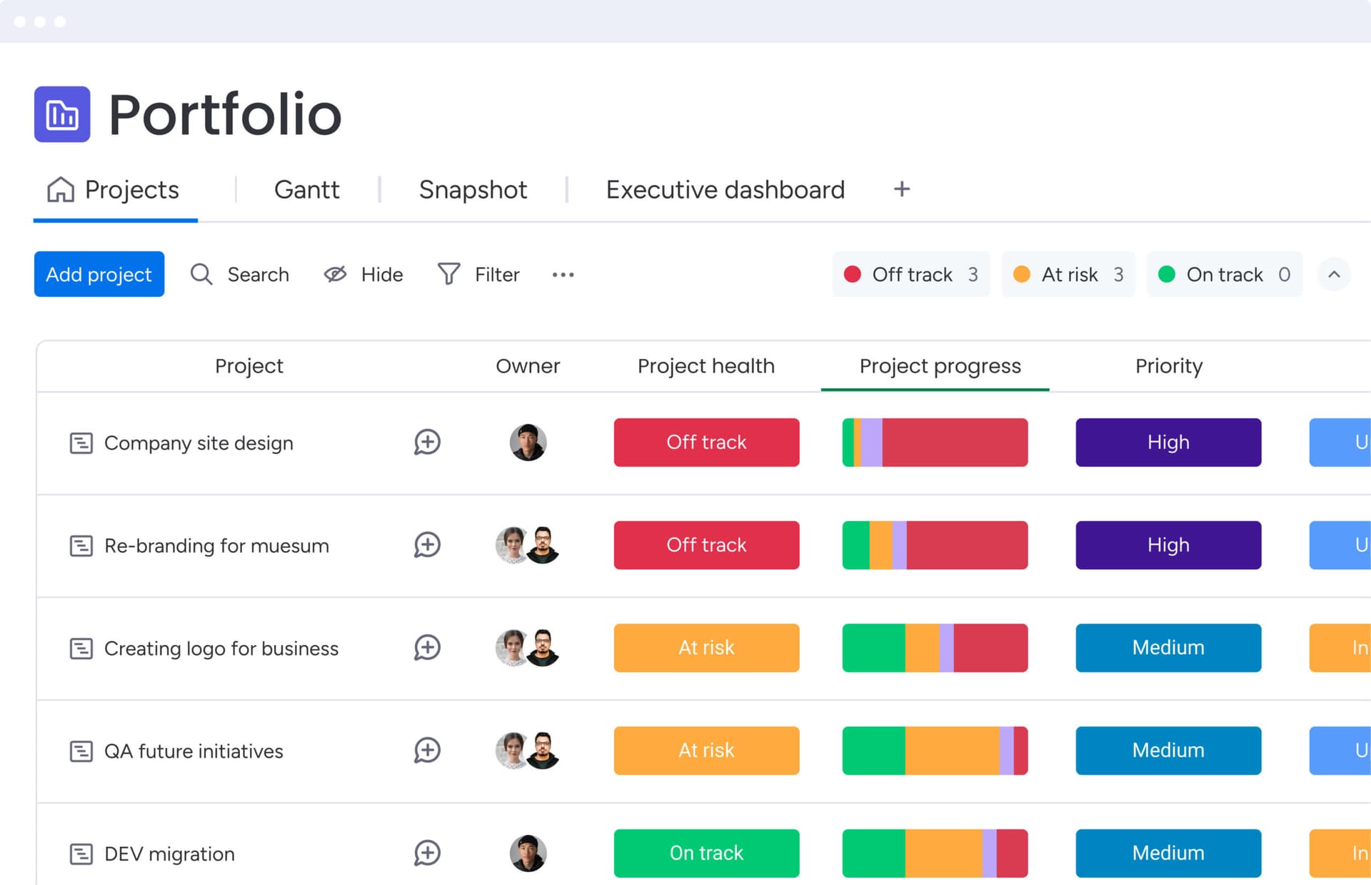
The guide breaks dashboard templates into working categories, and each one maps to a different business need. Rather than presenting dashboards as a single generic feature, monday.com separates them into project management, sales, marketing, finance, executive, KPI, and operations dashboards. That matters because the audience changes what the dashboard has to do: a sales leader wants pipeline clarity, while a product manager wants a cleaner read on delivery risk and bottlenecks.
The ingredients are practical, not decorative:
- visual widgets that surface the right information quickly
- live connections that keep data current
- filters that narrow the view to what matters now
- secure sharing for the right stakeholders
- template choice based on audience and function
That is the real cultural signal inside a modern SaaS company. A dashboard is no longer a static reporting screen where numbers go to sit. It is a coordination layer where managers and cross-functional teams decide what happens next.
How monday.com says the plumbing works
monday.com’s support documentation reinforces that point. Dashboards can aggregate data from connected boards, including boards in different portfolios, which means the screen is designed to pull from the operating system of work rather than from a single silo. The company also says external data can come in through import, sync integration, or API connection, giving teams more than one route to bring scattered information into a single view.
The company says its dashboards include over 30 widgets, and those widgets can surface specific columns from the underlying data. That detail matters for builders inside monday.com because it shows how the product is not just about display. It is about deciding which operational signals should be visible, to whom, and in what context. For engineering, that raises the stakes around freshness, security, and performance. For product managers, it turns reporting into part of the workflow itself. For sales, it changes the shape of executive conversations by replacing narrative updates with live data.
Scale is what makes the dashboard problem urgent
monday.com’s own growth helps explain why this dashboard story carries so much weight. The company said in March 2026 that more than 250,000 customers worldwide use the platform. In its FY2024 filing with the U.S. Securities and Exchange Commission, monday.com said enterprise customers, defined as those with more than $50,000 in annual recurring revenue, increased 39% year over year to 3,201 as of December 31, 2024.

As customer accounts get larger and more complex, the need for a single operational view grows with them. The dashboard conversation stops being about neat reporting and becomes about whether leaders can coordinate across functions without waiting for manual updates. monday.com’s own dashboards page leans into that need by promising real-time dashboards, reports, AI-generated summaries, contextual alerts, and “instant answers” through monday sidekick. That is a clear signal that the company sees visibility as a speed advantage.
AI is now part of the dashboard pitch
The most important product shift is that dashboards are being folded into monday.com’s AI story. The company says every product runs on the same AI layer, and that AI agents can automate tasks and run workflows. In the dashboard context, that means reporting is no longer just a readout of what happened. It becomes a place where insights can trigger action faster, with less handoff and fewer manual steps.
The guide ties that idea to dashboard templates that can combine widgets, AI-powered insights from monday sidekick and monday agents, and hundreds of integrations. That is a subtle but important move. monday.com is not just selling a visual layer on top of work. It is selling a system where the dashboard helps convert scattered operational data into decisions, and decisions into execution.
For product teams, that changes how dashboards are positioned inside the roadmap. For engineering, it raises the bar on reliability because the dashboard is only as useful as the data feeding it. For sales, it gives a cleaner way to show how the platform supports leadership visibility rather than just task tracking.
What the customer example is meant to prove
monday.com’s dashboards page also tries to make the productivity case concrete. The company says teams can track progress, spot bottlenecks, and make data-driven decisions, all while using more than 30 widgets. To show that in practice, it highlights a McDonald’s Australia testimonial claiming a 25% reduction in project management timelines, 1,224 hours saved per month, and 20,000 fewer emails sent per month.
That example should be read carefully, but it still reveals how monday.com wants dashboards to be understood internally and by customers: as infrastructure that reduces noise. Less email chasing, fewer status pings, and faster reporting cycles are not cosmetic benefits. They are the day-to-day mechanics of how a company clears work through its system. That is why dashboards matter so much in a workplace OS. They are where scattered updates become shared reality.
The bigger takeaway for monday.com
The dashboard guide says as much about monday.com’s product direction as it does about reporting itself. The company is increasingly framing dashboards as the surface where work becomes visible, AI becomes useful, and cross-functional teams can act without waiting for someone to compile the latest version of the truth. In a business with more than 250,000 customers and a growing enterprise base, that is a meaningful shift.
For employees inside monday.com, the message is hard to miss: the dashboard is no longer a side feature. It is part of the company’s culture story, its workflow story, and its AI story all at once.
This article was produced by Prism’s automated news system from verified source data, official records, and press releases, then run through automated quality and moderation checks before publishing. The system is built and supervised by the people who set the standards it runs under. Read our full AI policy.
Know something we missed? Have a correction or additional information?
Submit a Tip